Flutter Widgets ( Text & Rich Text) the Whole Picture
Flutter has moved to 3.0 bringing amazing new changes, especially the biggest announcement that the macOS and Linux platforms have reached stable, in addition to Windows. You can now develop your app to run on any or all of these platforms. Wow! I think it is a great achievement in the field of programming and development of applications that a single code base can now build applications for so many different devices and the web at the same time. All Flutter developers around the world are really excited!
Well, today I am here to write about the Text widget and Rich Text widget in detail. These widgets are the most commonly used in any Flutter application, especially the Text Widget.
I am aware there are many articles already written on the Text widget, but there have been many changes to it since then. Or maybe others have not found it as important to write about all the parameters as I do.
Let’s get on with it…
Text Widget
First, we will look at the constructor and then will into detail about all its properties.
Text(
  String data, {
  Key? key,
  style TextStyle(),
  strutStyle StrutStyle(),
  textAlign TextAlign(),
  textDirection TextDirection.ltr,
  locale Localizations.localeOf(context),
  softWrap true or false,
  overflow TextOverFlow.visible or clip or overflow or ellipsis,
  textScaleFactor double,
  maxLines int,
  semanticsLabel String,
  textWidthBasis TextWidthBasis.parent or longestLine,
  textHeightBehavior TextHeightBehavior.fromEncoded(0),
})String: Text that needs to be displayed on the screen should be entered within single or double quotes, eg: ‘hello world’, “hello world”.
textAlign: It is used to align text horizontally. Using the TextAlign widget, you can align the text in six different ways, which are:
/// align text on the left edge of the container
TextAlign.left
/// align text on the right edge of the container
TextAlign.right
/// align text on the center of the container
TextAlign.center
/// the text will be stretched to fill the width of the container
TextAlign.justify
/// align text to the trailing left edge of the container
TextAlign.start
/// align text to the trailing right edge of the container
TextAlign.endtextDirection: This property is used to change the direction of the text typed. Either from left to right (English) or right to left (Arabic).
softWrap: It determines if the complete text should be shown or not. If true it will show the text and if false the text gets clipped beyond the specified horizontal width.
overFlow: This property is used to determine if the text will fit in the available space provided by the parent widget. This usually works if the text widget is wrapped inside a container with height and width constraints.
textScaleFactor: It will scale the text inside the Text widget beyond the specified font size. For example, if the value is set to 1.5 the text will be 50% larger than the original size.
maxLines: Depending on the value entered it will truncate the lines of text entered.
semanticsLabel: If you are using abbreviations on your application this property comes in handy. You can specify the text using the “r” keyword which means raw string data followed by the sign or abbreviation within the quotes. Then specify the semanticsLabel as to what that property means.
Example of semantics label
Text(r '$$', semanticsLabel: 'Double dollars')textWidthBasis: It is used to control how the text width is defined.
textHeightBehavior: It is used to control how the multi-line text appears between the first and last lines.
style: This is the most common property a developer uses to style the text by using the TextStyle widget. TextStyle widget has several different properties such as foreground and background color, font size, font weight, letter and word spacing, locale, shadows, etc.
Rich Text Widget
If you have a line or a paragraph with multiple styles such as bold, italics, underlined, different colors, and different font sizes then you should be using the Rich Text widget. It gives the developer power to style the text in multiple ways without using multiple Text widgets.
How does it work?
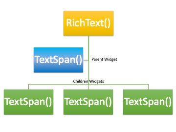
The Rich Text widget has a tree of Text Span widgets and each Text Span widget has its own text styling property. The image below explains the hierarchy to follow while creating a Rich Text widget.
RichText(
// Parent Widget
  text: TextSpan(
	text: 'First line!\n',
	style: TextStyle(fontSize: 14, fontFamily: 'Roboto'),
	children: <TextSpan>[
// Child Widget
  	TextSpan(
    	text: 'Second line!\n',
    	style: TextStyle(
      	fontSize: 22,
      	fontFamily: 'Roboto',),),
  	TextSpan(
    	text: 'Third line!\n',
    	style: TextStyle(
      	fontSize: 14,
      	fontFamily: 'Roboto',
    	),
  	),
	],
  ),
),
If you look at the above code you will notice that each Text Span widget has its own styling property which takes in a TextStyle widget similar to the Text Widget.
Example:
A classic example is when you are creating a login and a signup screen. Switching between login and signup screens and also adding forgot password button inline with the Text Widget, that when the Rich Text widget comes into play. Let me show you by example by creating a very simple login screen and signup screen.
Login Screen code:
class LoginWidget extends StatelessWidget {
  final Function onPressed;
  LoginWidget({this.onPressed});
  @override
  Widget build(BuildContext context) {
	return Padding(
  	padding: const EdgeInsets.all(16.0),
  	child: Column(
    	crossAxisAlignment: CrossAxisAlignment.stretch,
    	children: [
      	SizedBox(
        	height: 100,
      	),
      	Center(
        	child: Text(
          	'User Login',
          	style: TextStyle(
            	fontSize: 28,),),),
      	SizedBox(
        	height: 100,
      	),
      	TextField(
        	keyboardType: TextInputType.name,
        	textInputAction: TextInputAction.next,
        	decoration: InputDecoration(
            	labelText: 'Enter Username', border: OutlineInputBorder()),
      	),
      	SizedBox(
        	height: 20,
      	),
      	TextField(
        	keyboardType: TextInputType.text,
        	obscureText: true,
        	decoration: InputDecoration(
            	labelText: 'Enter Password', border: OutlineInputBorder()),
      	),
      	SizedBox(
        	height: 40,
      	),
      	ElevatedButton(
        	style: ElevatedButton.styleFrom(
            	padding: EdgeInsets.only(top: 10.0, bottom: 10.0)),
        	onPressed: () {},
        	child: Text(
          	'Login',
          	style: TextStyle(
            	fontSize: 22,),),),
      	SizedBox(
        	height: 30,
      	),
      	RichText(
        	textAlign: TextAlign.center,
        	text: TextSpan(
          	text: 'Not a member yet ?   ',
  	        style: TextStyle(
            	fontSize: 18,
            	color: Colors.black,
          	),
          	children: [
            	TextSpan(
                	text: 'Sign Up !',
                	style: TextStyle(
             	       fontSize: 18,
                    	color: Colors.blue,
                    	decoration: TextDecoration.underline),
                	recognizer: TapGestureRecognizer()..onTap = onPressed),
          	],
        	),
      	),
   	 ],
  	),
	);
  }
}
SignUp Screen code:
class SignUpWidget extends StatelessWidget {
  final Function onPressed;
  SignUpWidget({this.onPressed});
  @override
  Widget build(BuildContext context) {
	return Padding(
  	padding: EdgeInsets.all(16.0),
  	child: Column(
    	crossAxisAlignment: CrossAxisAlignment.stretch,
    	children: [
      	SizedBox(
        	height: 100,
      	),
      	Center(
        	child: Text(
          	'User Sign Up',
          	style: TextStyle(
            	fontSize: 28,),),),
      	SizedBox(
        	height: 50,),
      	TextField(
        	keyboardType: TextInputType.name,
        	textInputAction: TextInputAction.next,
        	decoration: InputDecoration(
            	labelText: 'Enter Email', border: OutlineInputBorder()),),
      	SizedBox(
        	height: 20,),
      	TextField(
        	keyboardType: TextInputType.name,
        	textInputAction: TextInputAction.next,
        	decoration: InputDecoration(
            	labelText: 'Enter Username', border: OutlineInputBorder()),
      	),
      	SizedBox(
        	height: 20,
      	),
      	TextField(
        	keyboardType: TextInputType.name,
        	textInputAction: TextInputAction.next,
        	obscureText: true,
        	decoration: InputDecoration(
            	labelText: 'Enter Password', border: OutlineInputBorder()),
      	),
      	SizedBox(
        	height: 20,
      	),
      	ElevatedButton(
        	style: ElevatedButton.styleFrom(
            	padding: EdgeInsets.only(top: 10.0, bottom: 10.0)),
        	onPressed: () {},
        	child: Text(
          	'Sign Up',
          	style: TextStyle(
            	fontSize: 22,),),),
      	SizedBox(
        	height: 30,
      	),
      	RichText(
            textAlign: TextAlign.center,
        	text: TextSpan(
          	text: 'Already a member ?   ',
          	style: TextStyle(
            	fontSize: 18,
            	color: Colors.black,
          	),
          	children: [
                TextSpan(
                	text: 'Login !',
                	style: TextStyle(
                    	fontSize: 18,
                    	color: Colors.blue,
                    	decoration: TextDecoration.underline),
         	       recognizer: TapGestureRecognizer()..onTap = onPressed),
          	],),),
    	],),);
  }
}
Just to compare if we were not using the Rich Text widget then how we would be creating similar to the above code. Just replacing the RichText widget with the below code.
Row(
  mainAxisAlignment: MainAxisAlignment.center,
  children: [
	Text(
  	'Already a member ?',
  	style: TextStyle(fontSize: 18),
	),
	TextButton(
  	onPressed: onPressed,
  	child: Text(
    	'Login !',
    	style: TextStyle(
        	fontSize: 16.0, decoration: TextDecoration.underline),
  	),
	),
  ],
),
Here you will be able to see a Row widget is used and then a Text widget is used and then a TextButton is used. But the same thing can be achieved by using the RichText widget which gives the flexibility of styling inline Text to different properties.
My passion is to write about Flutter widgets and explore their in-depth properties. As avid readers, if you have any suggestions or if you have any particular widget in mind on which you wish me to write, feel free to drop in a message and I will explore and experiment and write every bit of detail I can find on it.
Thank you very much for following me and reading my articles. It gives me immense pleasure when I see someone has followed and read my article and has clapped for me.
Appreciate the creator