
Exploratory Data Analysis WomenTechWomenYes Annual Gala
0. Introduction
Hi everyone, the first project of Data Science Bootcamp in partnership with Istanbul Data Science Academy has been completed with presentations, and so far it’s been a very enlightening experience. Below I try to explain the first project we did in that period, which was an exploratory data analysis of the MTA turnstile and other supportive datasets using Python paired with NumPy, pandas, matplotlib, seaborn, and DateTime.
First of all, you can visit the project’s GitHub repository from here.
1.a. Problem Statement
As we mentioned, we are interested in harnessing the power of data and analytics to optimize the effectiveness of our street teamwork, which is a significant portion of our fundraising efforts.
WomenTechWomenYes (WTWY) has an annual gala at the beginning of the summer each year. As we are a new and inclusive organization, we try to do double duty with the gala both to fill our event space with individuals passionate about increasing the participation of women in technology and to concurrently build awareness and reach.
To this end, we place street teams at entrances to subway stations. The street teams collect email addresses and those who sign up are sent free tickets to our gala.
Where we’d like to solicit your engagement is to use MTA subway data, which as I’m sure you know is available freely from the city, to help us optimize the placement of our street teams, such that we can gather the most signatures, ideally from those who will attend the gala and contribute to our cause.
1.b. Problem Statement
‘‘ How should WTWY place street teams most effectively? ”
Gather maximum email addresses
Gain ideal attendees for WTWY
Find financial contributors
Consider size and time constraints
2. Methodology
Gathered New York City MTA Turnstile Data between January 02, 2021, and March 13, 2021, which is 10-week. As the name suggests, the dataset provides information on every turnstile at every station managed by the MTA. Regularly scheduled audits provide the number of entries and exits within four-hour periods, with a few exceptions — some audits occur outside the regularly scheduled intervals due to planning or troubleshooting activities and some audits are missed. In total, I analyzed a set of 2,092,870 rows of turnstile data and summarized our methodology in 3 basic steps ;
Finding Top 5 NYC Stations by Total Traffic
Filtering Top 5 NYC Stations by Household Income
Suggesting most appropriate NYC Stations by Hourly Traffic
3. Data Cleaning & Processing
We have taken the following 10-week’s of MTA data.
 Figure 1: Original MTA Dataset
After that, made some cleaning on columns as dropping or cleaning blank characters at column names.
Each turnstile is defined by 4 components (“C/A”, “Unit”, “SCP”, “Station”) represented as 4 separate columns in the dataset, therefore we had to group the rest of the data by these four components to analyze each turnstile.
As seen from the MTA dataset, we know that ENTRIES and EXITS are the cumulative entry and exit register values for a given entry and exit point respectively. Since we are aggregating by day rather than by period for the first analysis, we decided to subtract the first which is the smallest one from the last which is the largest one’s counter values for entries and exits respectively.
We also aggregated entries and exits into a single column, TRAFFIC, as well as appended weekday attributes to make it easier to analyze the data by weekday later. Our results were put into mta_entries_exits.
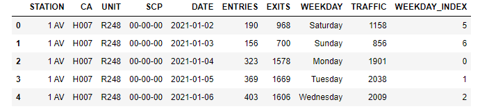 Figure 2: Daily Total Traffic Dataset
We see that from the following code snippet there are no null values in the dataset but we will investigate irrelevant and outlier values to clean it.
 Figure 3: Data Cleaning
You can look at the box plot of the ENTRIES and EXITS columns.
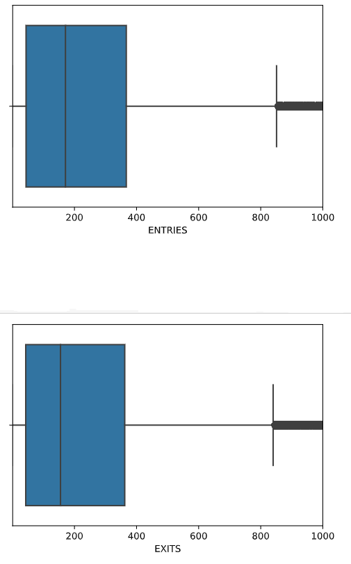 Figure 4: Box plot of ENTRIES and EXITS columns
We have decided that more than 17,000 total entries or exits are not sensible so removed them as outlier values.
4. Exploratory Data Analysis & Key Findings
Now we have found the Top 5 NYC Metro Stations by Total Traffic as follows ;
34 ST-PENN STA
34 ST-HERALD SQ
86 ST
125 ST
GRD CNTRL-42 ST
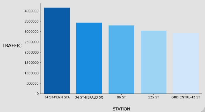 Figure 5: Top 5 Stations By Total Traffic
We realized that all these 5 stations are in the same region which is Manhattan. We found Manhattan is the richest one in NYC as average household income using an external dataset so we have decided to focus on these 5 NYC stations.
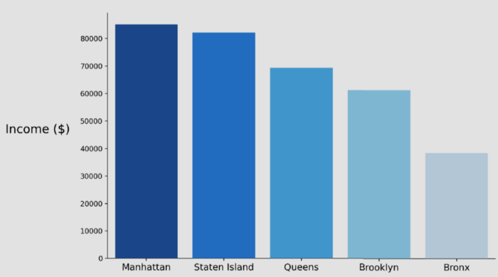 Figure 6: NYC Regional Average Income
Now we have found the Top 5 NYC Metro Stations by Average Income as follows ;
86 ST
GRD CNTRL-42 ST
34 ST-PENN STA
34 ST-HERALD SQ
125 ST
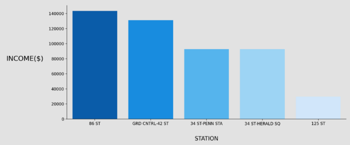 Figure 7: Top 5 Stations Average Income
We have made an assumption as; One thing we thought would be helpful would be to find stations where the number of tourists is low (people who will not be around to attend the Gala) and most riders are native New Yorkers (people who will). Stations that are used primarily for commuting will have many more native residents than those that are popular tourist locations. For this reason, selected stations should have a high difference between weekday and weekend in total traffic.
We can extract day-based total traffic for every station as follows ;
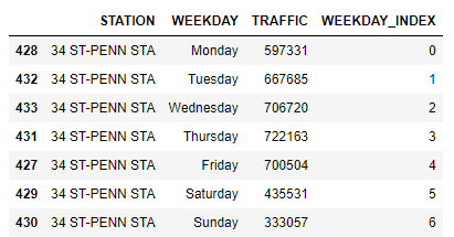 Figure 8: First Station’s Day-Based Traffic Dataset
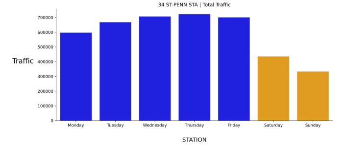 Figure 9: First Station’s Day-Based Traffic
Similarly, we have concatenated 5 stations together and all of them verify that they are not touristic stations.
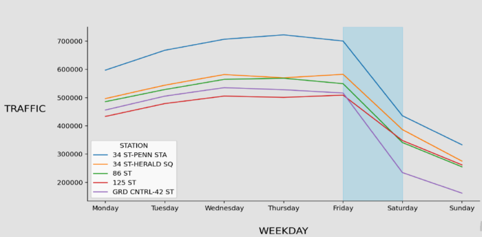 Figure 10: 5 Stations Weekday Traffic
In addition, we have moved forward by analyzing the dataset for 4 hours time period to make better recommendations for street teams.
We added also to get every station's total hourly period traffic and took dataframe given below.
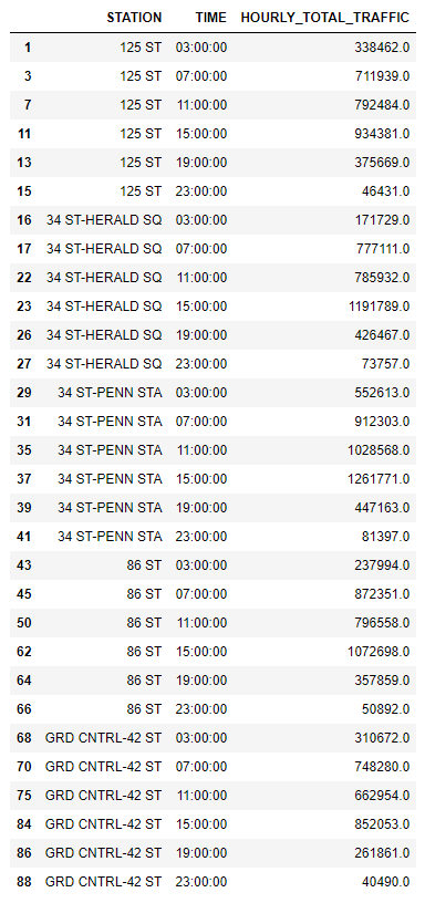 Figure 11: 5 Stations Hourly Traffic Dataset
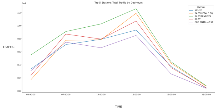 Figure 12: 5 Stations Traffic By DayHours
As the last step, we visualized the above dataframe with a heatmap to interpret the results more clearly.
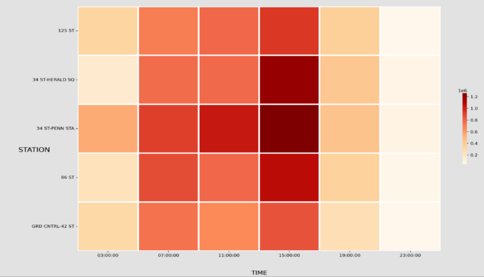 Figure 13: Stations DayHour Heatmap
5. Recommendations & Future Works
After the data cleaning, processing, exploratory analysis, and feature engineering process, I have recommended the following strategy to business development and street teams.
 Figure 13: Recommendation Table for Business
We can list the following steps for future works ;
Use 2020 ’s census data when it is published
Look at the Education Level of the people and the Unemployment Levels of the people in the stations
Search for the companies that empower women in the Tech Fields
6. Conclusion
This is the end of the article. In this article, I try to explain in detail the first project of our Data Science Bootcamp. As a reminder, you can visit the project’s GitHub repository from here. Hope to see you in my next article…
Appreciate the creator