
Alibaba’s Iconic Logo, Meaning and It’s Historical Evolution
The One Man Journey from $80,000 to $160 Billion Market Value
A Journey of Innovation and Success in the Global Marketplace

Alibaba, a China-based e-commerce giant operating globally, faces logo criticism despite its vast success. Unlike the fairy-tale-themed name, Alibaba opts for a pragmatic logo reflecting its diverse business ventures.
Focused on legibility for effective marketing, Alibaba, founded in 1999 by Jack Ma and a group of 18 co-founders, has become a multinational conglomerate. Its journey showcases logo evolution, highlighting a commitment to innovation — a principle echoed by professional logo design USA by Logo Magicians.
Alibaba Logo Evolution
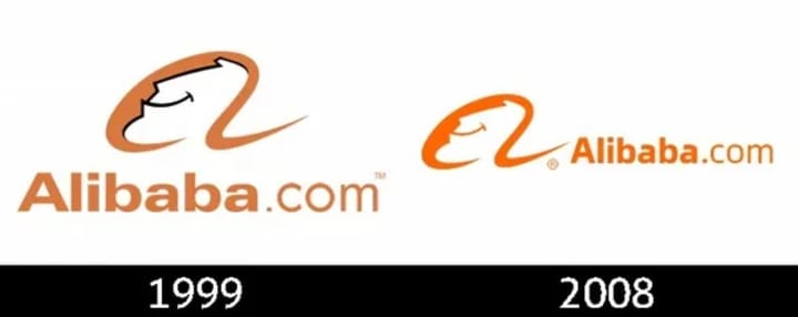
Alibaba’s logo evolution: 1999–2008 featured a lowercase “a” with a human face in yellow on beige; 2008-present showcases a cartoony face, sans-serif “a,” on a bright orange background.
Symbolism and Meaning
Alibaba’s logo is a symbol of happiness and success with a smiley face, while the orange color signifies energy and passion. The letter ‘a’ reflects the company’s welcoming embrace to customers worldwide.
The letter ‘a’ in Alibaba’s logo not only stands for the company’s name but also symbolizes the folk tale character Ali Baba, representing the treasure trove of opportunities on the platform. The logo embodies openness, happiness, and success, aligning with Alibaba’s mission to make business easy worldwide.
Here are some of the specific meanings of the symbols in the Alibaba logo:
Smiley face: Happiness, satisfaction, success
Orange color: Energy, passion, creativity
Letter “a”: Open arms, welcoming customers from all over the world, Alibaba
The Alibaba logo is a well-designed and effective symbol of the company’s mission and values. It is a simple and memorable design that is sure to leave a positive impression on its customers.
1999–201?
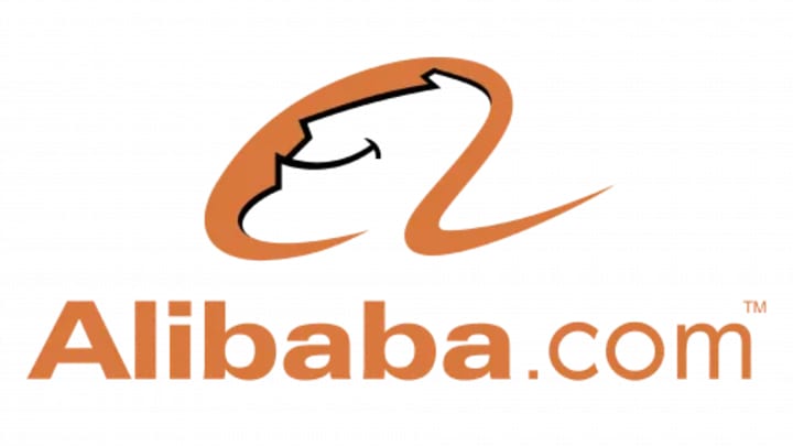
The original 1999 Alibaba badge showcased a calm terracotta palette with a cursive ‘A’ emblem, representing a man’s profile, positioned above the logotype on a white background.
201? — now
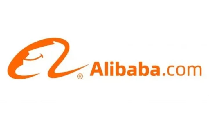
In the 2010s redesign, Alibaba’s visual identity shifted to a vibrant orange palette, giving the badge a dynamic and modern feel. The refined emblem, sans black outlines, now accompanies bold geometric lettering in a sleek sans-serif typeface
Symbol

Alibaba’s logo features a smiling lowercase ‘a’ with a human face, symbolizing a satisfied customer. Below, Alibaba is written, with the first part in bold for emphasis. with the first part in bold for emphasis.
Emblem criticism

Alibaba’s logo faced criticism for its generic typeface, Linotype Univers, and a predictable visual metaphor. Despite design concerns, Alibaba ranks among the top 10 publicly traded companies globally, showcasing the logo’s effectiveness in its business context
Font
Alibaba’s logo combines Universe font for ‘Alibaba’ and Pluto Sans font for ‘com.’ The specific typefaces used are Linotype Universe Com 740 Extended Heavy and Pluto Sans Regular, ensuring clarity and legibility in various sizes
Colors
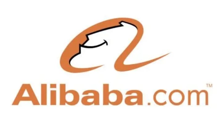
Orange is known as the color most easily seen in dim light or against the water, which is the reason why it’s often used, for instance, for life rafts, life jackets. This particularly refers to the shade called safety orange, which is very close to the one used on the emblem of the Alibaba group.
History and Growth

In 1999, Jack Ma founded Alibaba in his apartment, aiming to connect Chinese manufacturers with global buyers. Despite initial challenges, the company’s relentless focus on innovation and customer satisfaction propelled its success.
The launch of Taobao in 2003 marked a turning point, challenging eBay in China. Alibaba diversified into digital payments with Alipay and cloud computing with Alibaba Cloud, becoming a technology giant.
The company went public in 2014 with its record-breaking initial public offering on the New York Stock Exchange, raising over $25 billion. This IPO was the largest in history at the time, solidifying Alibaba’s presence on the global stage.
Conclusion
Alibaba’s logo, despite facing designer criticism, has proven effective in the competitive business landscape. The combination of Univers and Pluto Sans fonts reflects a deliberate choice for clarity and legibility.
Similarly, when considering the success of Alibaba as one of the top publicly traded companies globally, the logo has clearly served its purpose.
Just as businesses in Dallas Logo Design has the expertise of a professional logo designer, Alibaba’s logo underscores the importance of strategic design choices made by logo design firms and companies worldwide.
Appreciate the creator